How to Write a Call to Action That People Actually Click

The button is the smallest piece of copy on the page and the one everything else was building toward. It is also the piece most likely to have been left at whatever the template said — usually Submit. A landing page CTA is the smallest piece of copy on the page and the one carrying the most weight.
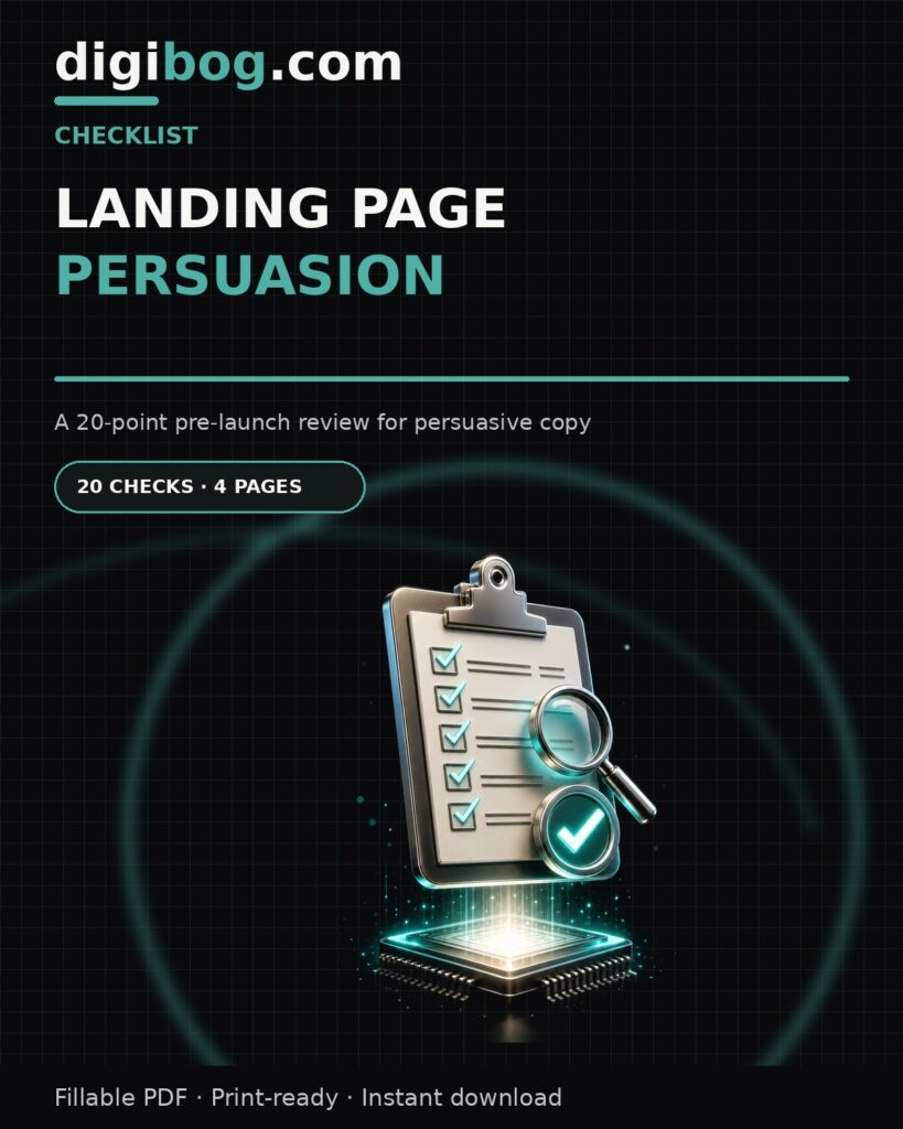
Landing Page Persuasion Checklist, a 20-point pre-launch review
Landing Page Persuasion — Checklist

Describe the outcome, not the mechanic

Submit describes what happens to your database. Get the checklist describes what happens to the reader.

The simplest upgrade available: start the button with a verb the reader benefits from, and follow it with the thing they receive. Send my guide. Start the free trial. Book the call.

First-person phrasing sometimes lifts clicks — Start my trial rather than Start your trial. Test it rather than assuming; the effect is real but not universal.

Match the button to the stage they are at

A visitor who has just discovered you does not want the same next step as one who has read every word.

  • Cold — low commitment. Learn what it costs. See an example.
  • Considering — more involvement, still reversible. Start free. Try one.
  • Ready — the actual transaction. Buy now. Book the call.

Putting a Ready button in front of a cold visitor is the most common CTA mistake. Nothing about the button is wrong; it is asking for a commitment the reader has not built up to.

Make it visually obvious

Contrast is not decoration. If the button uses the same colour as your headings, links and section dividers, it stops reading as the thing to click.

Give it a colour used nowhere else. Give it space — a button crowded by text reads as part of the text. Make it large enough to hit comfortably on a phone.

Repeat the landing page CTA

One button at the very bottom assumes everyone reads to the end. They do not. Some people are convinced by the third paragraph and have nothing to click.

Place the same action after each section that could plausibly close someone. Same wording every time — two differently worded buttons make a reader stop and choose, and stopping is what you are trying to avoid.

Reduce what is at stake beside it

The line directly under the button does more work than its size suggests. It is where the last hesitation gets answered.

No card required. Cancel anytime. Instant download. Takes about two minutes.

Each removes a specific fear at the exact moment it appears. Keep it to one line; a paragraph there reintroduces doubt instead of removing it.

Test one thing

If you change the wording, the colour and the placement at once and clicks improve, you have learned nothing you can reuse.

Change one element. Give it enough traffic to mean something. Write down what happened. That is slower than a redesign and it compounds, because each result tells you something true about your audience.

$11.99

Twenty-five prompts for the words around the button

Landing Page Persuasion Prompts is a 7-page copy-ready PDF of 25 AI prompts for headlines, objections, proof and calls to action — written to be pasted straight into whichever model you use.

See the promptsInstant download · unlimited downloads · no expiry · one payment, no subscription

Button text, rewritten

Most buttons are labelled with the mechanic of clicking rather than the reason for clicking. The fix costs nothing.

WeakStrongerWhat changed
SubmitSend my briefDescribes what happens, and whose thing it is
Sign upStart my free weekNames the value, not the admin
Learn moreSee the full syllabusSays exactly what is on the other side
Buy nowGet instant accessLeads with what they receive, not what they lose
DownloadDownload the checklist (PDF, 2 pages)Removes uncertainty about what is arriving
Contact usBook a 15-minute callBounds the commitment. “Contact” is open-ended and slightly threatening.

The pattern is first person and specific. “Start my free week” reads as the visitor’s own decision. “Sign up” reads as a form standing between them and something else.

Match the ask to the temperature

A button that asks for more than the page has earned will not be clicked, however well it is worded. The right ask depends on how much the reader already knows about you.

Where they came fromWhat they knowReasonable ask
Cold ad or social postNothing. They saw one line.Something free and immediate. A guide, a demo, a short video.
Search for a problemThey have the problem. Not that you exist.A low-commitment step. A checklist, a calculator, a trial.
Search for your nameThey are already considering you.Buy, book, or start. Do not make them warm up again.
Your email listThey have heard from you repeatedly.The direct ask. Anything softer wastes the relationship.

The most common mismatch is asking cold traffic to book a call. It is not that the button is badly worded. It is that a stranger is being asked for thirty minutes of their day by someone they met four seconds ago.

What sits beside the button

The button is rarely the last hesitation. The line underneath it is where the remaining fear lives, and most pages leave it empty.

  • What happens next. “You will get the download link immediately, no account needed.”
  • What it costs to change their mind. “Cancel any time from your account, two clicks.”
  • What you will not do. “No card required. We will not add you to a mailing list.”
  • How long it takes. “Takes about 40 seconds.”

One line, chosen for the specific fear your reader has. If you do not know which fear that is, the objections behind it are covered in the four objections killing your landing page.

The three-second test

Before changing anything, check whether the button can be found at all. Open your page, look away, look back, and count how long it takes to spot the action. If it is more than about three seconds, wording is not your problem.

Four things break findability, in rough order of frequency:

  1. Nothing else is competing, but the button is quiet. A pale outline button on a white page reads as decoration. It needs to be the loudest element on the screen.
  2. Too many things are shouting. Three coloured boxes, a banner and a chat bubble. When everything is emphasised, nothing is.
  3. It sits in dead space. Buttons floating alone below a block of text get skipped. Place it where the eye already is, at the end of the argument that earns it.
  4. On mobile it is below the keyboard or the sticky bar. Check on an actual phone, not a narrow browser window.

Fix findability first. Rewriting a button nobody can locate is effort spent in the wrong place, and it is the same mistake as tuning copy on a page whose real problem is further up, covered in why your landing page gets traffic but no conversions.

Frequently asked questions

How many buttons should a landing page have?

As many as the page is long, all doing the same thing. Repeating one call to action at natural decision points is not pushy. Offering three different actions is, because it turns a decision into a comparison.

Does button colour matter?

Contrast matters. Colour barely does. The button should be the most visually obvious thing on the screen, whatever colour achieves that against your design. Endless tests of green against orange are how people avoid rewriting the copy.

Should the button say “free” if the thing is free?

Yes, and early. Free removes the largest objection instantly. “Start my free week” outperforms “Start my week” for the obvious reason, and it also sets a correct expectation, which reduces refund requests later.

Where should the first button go?

Wherever the reader has enough information to say yes. For a simple, cheap or familiar offer, that can be the first screen. For anything expensive or unfamiliar, a button before the explanation just gets ignored and makes the page feel pushy.

How do I test a call to action properly?

Change one thing, leave everything else alone, and run it long enough to cover a full week. If you rewrite the button, the surrounding line and the headline at once, you will not know which one moved the number, and you will carry the wrong lesson to the next page.

Try this now

Look at your button and read it out loud on its own. If it describes a form action rather than a reader outcome, rewrite it in the next two minutes. That single change is often the highest-return edit on the whole page.

The 20-point pre-launch checklist covers CTA contrast, placement and stage-matching, and the toolstack lists the tools for running the test properly.

All six pieces — book, workbook, guide, prompts, toolstack and checklist — come together in the Landing Page Persuasion Complete Bundle.

Related reading: Why Your Landing Page Gets Traffic But No Conversions.

Browse the Landing Page Persuasion collection, then read how to write a landing page headline that earns the next line.


About the author. Written by Said Sihame, founder of DigiBog. I make the planners, workbooks and checklists sold on this site, and these articles come out of the same work. Everything here is what I use and test myself — take what fits and leave the rest.

Scroll to Top